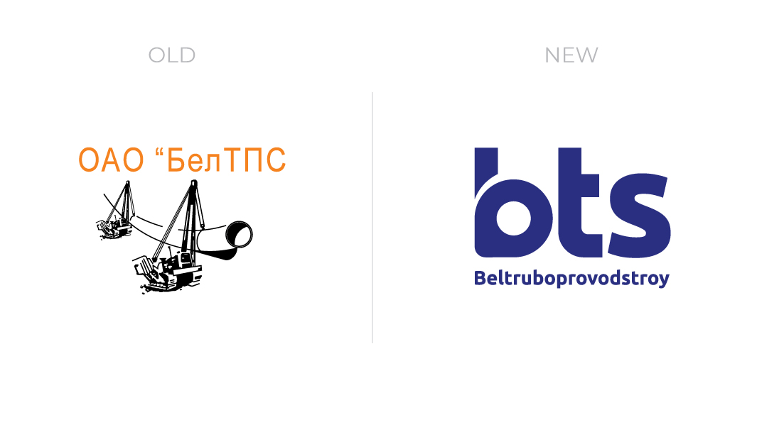
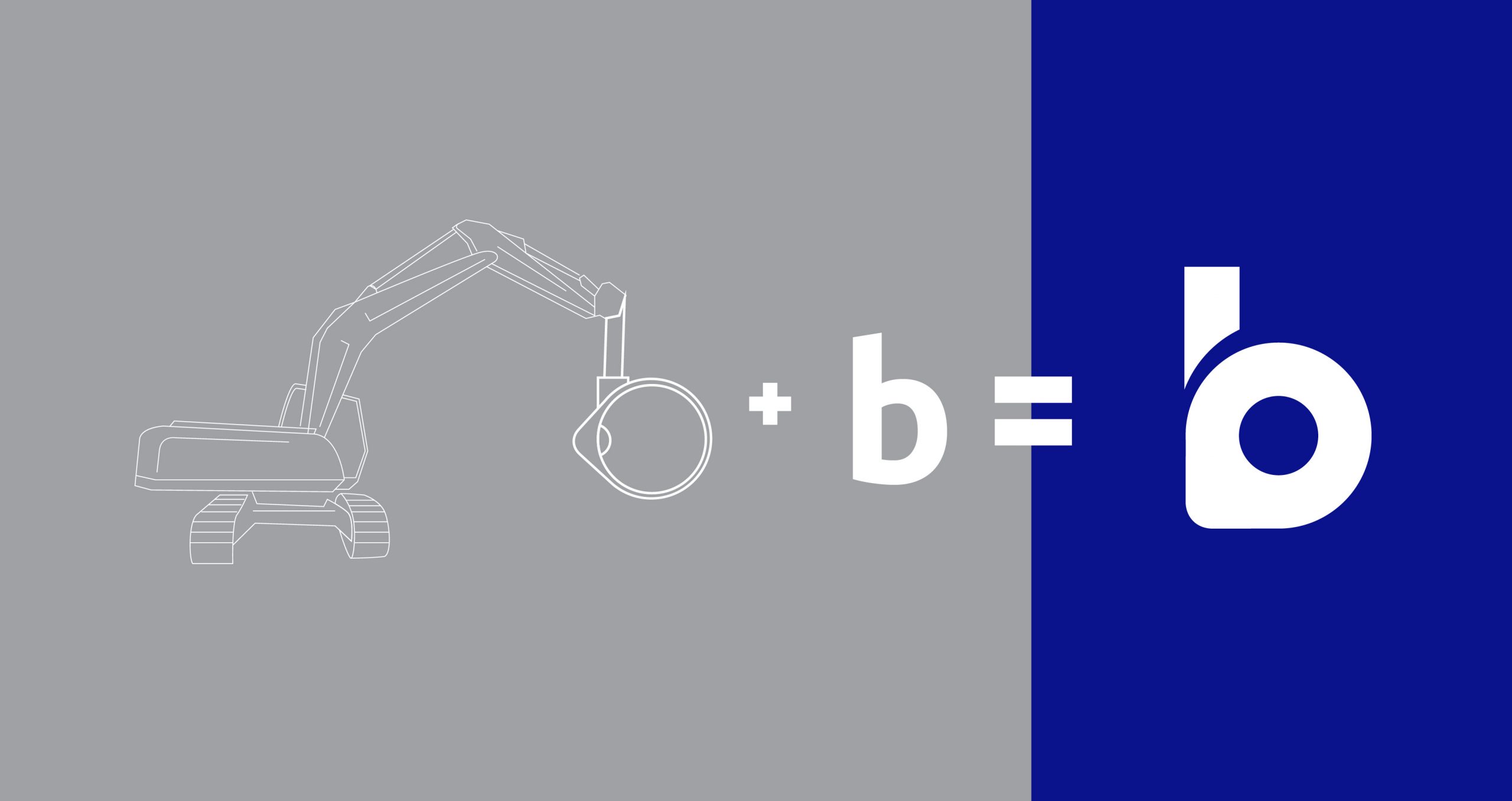
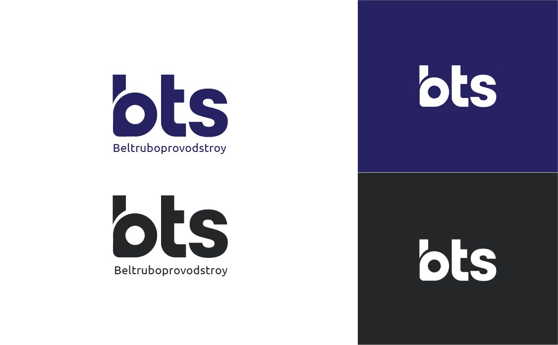
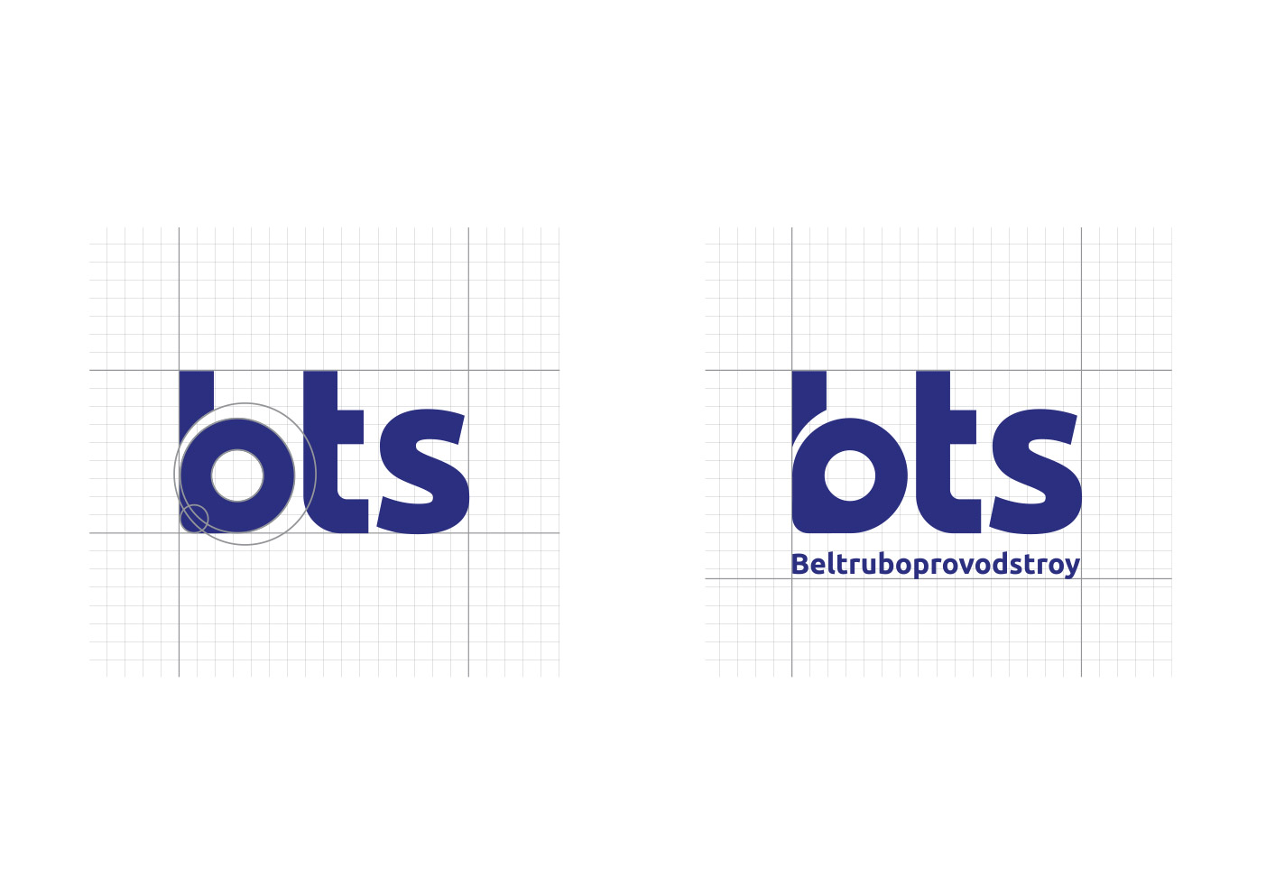
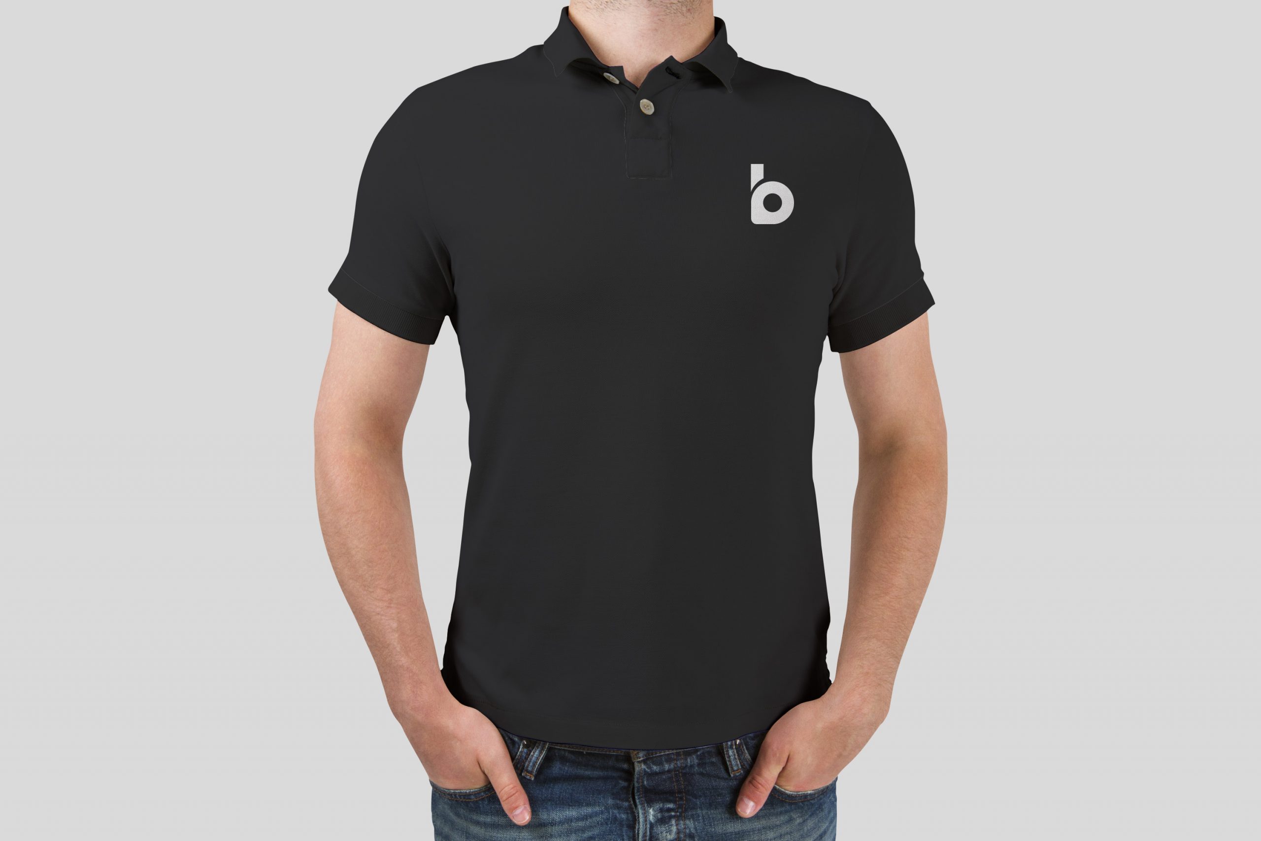
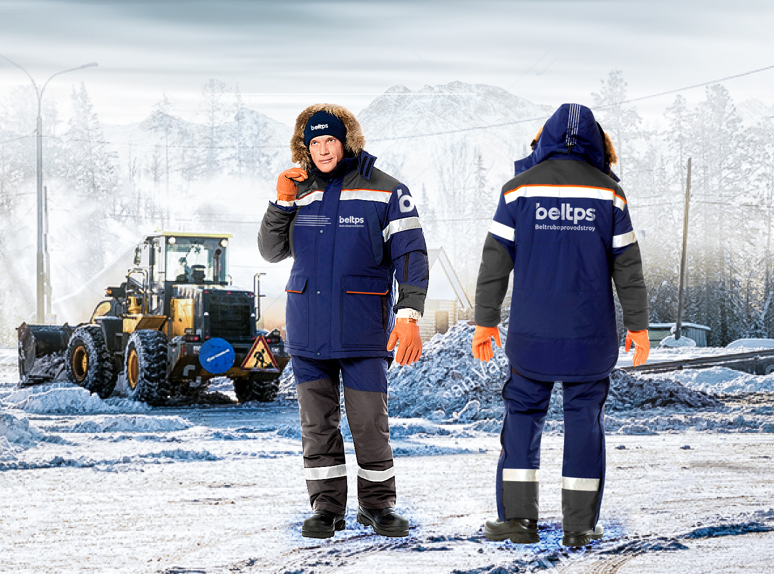
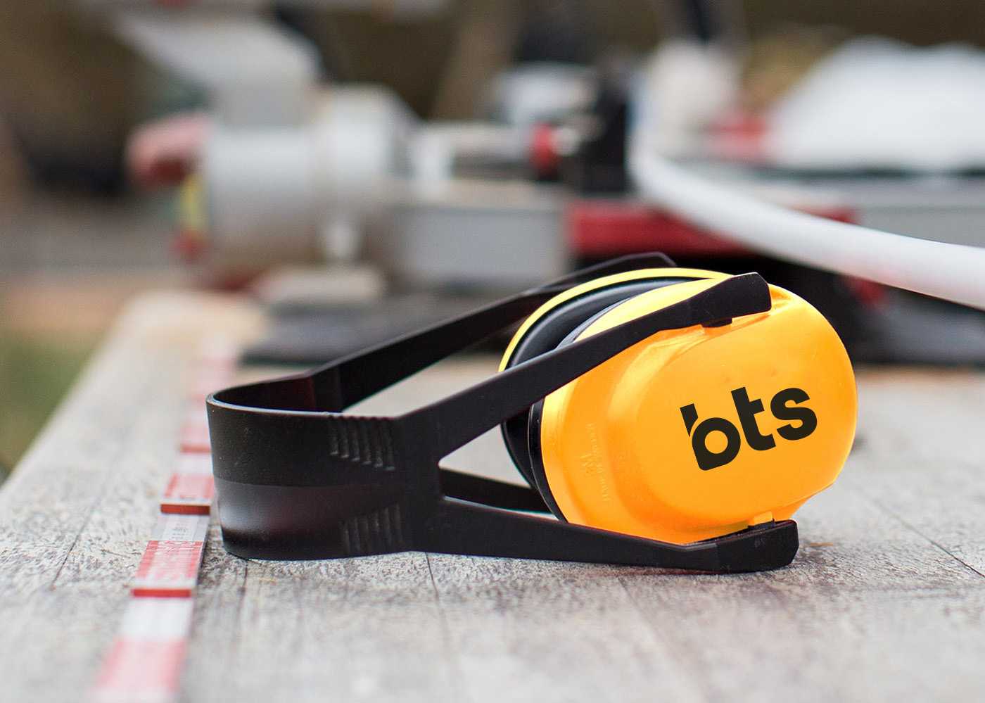
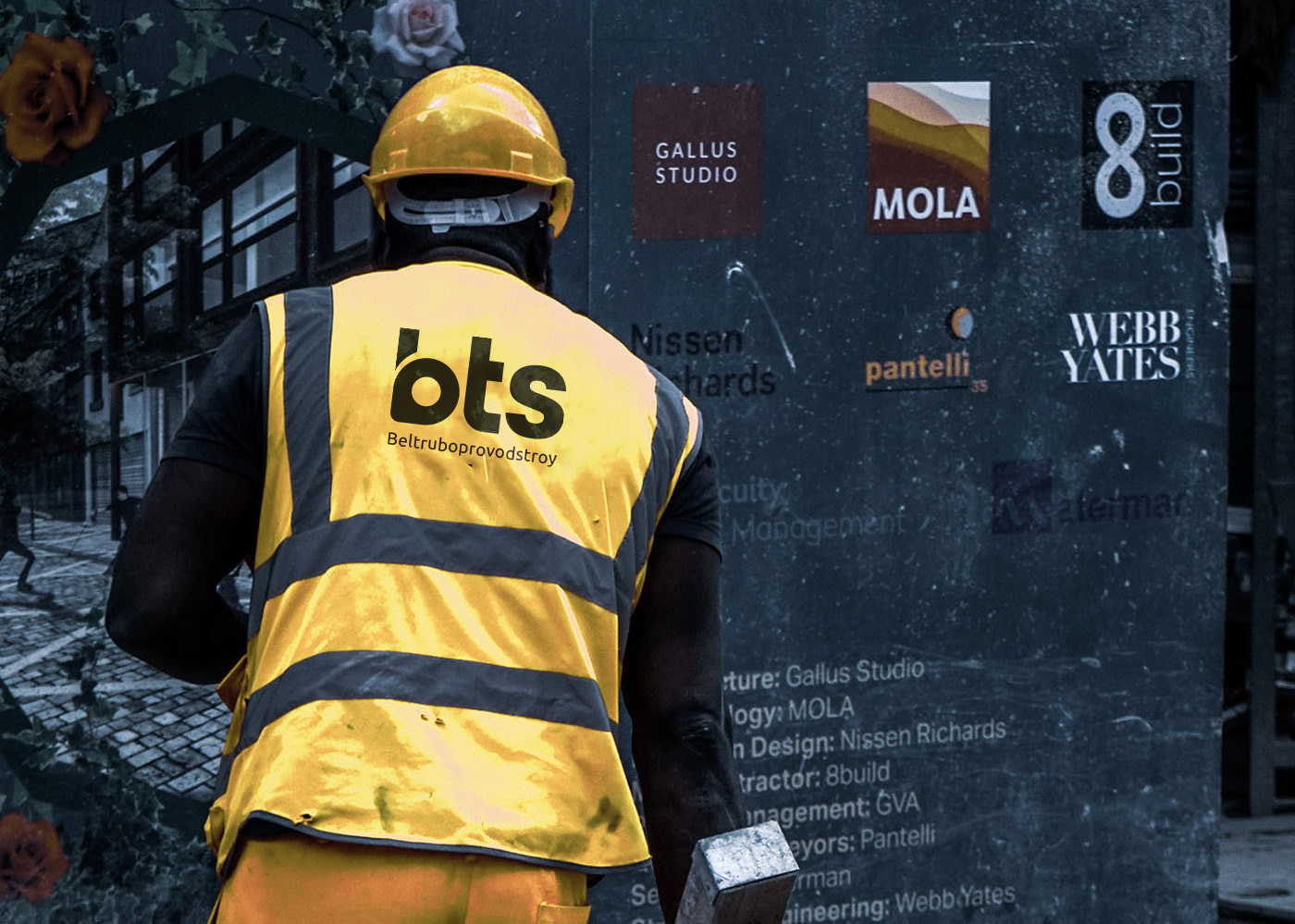
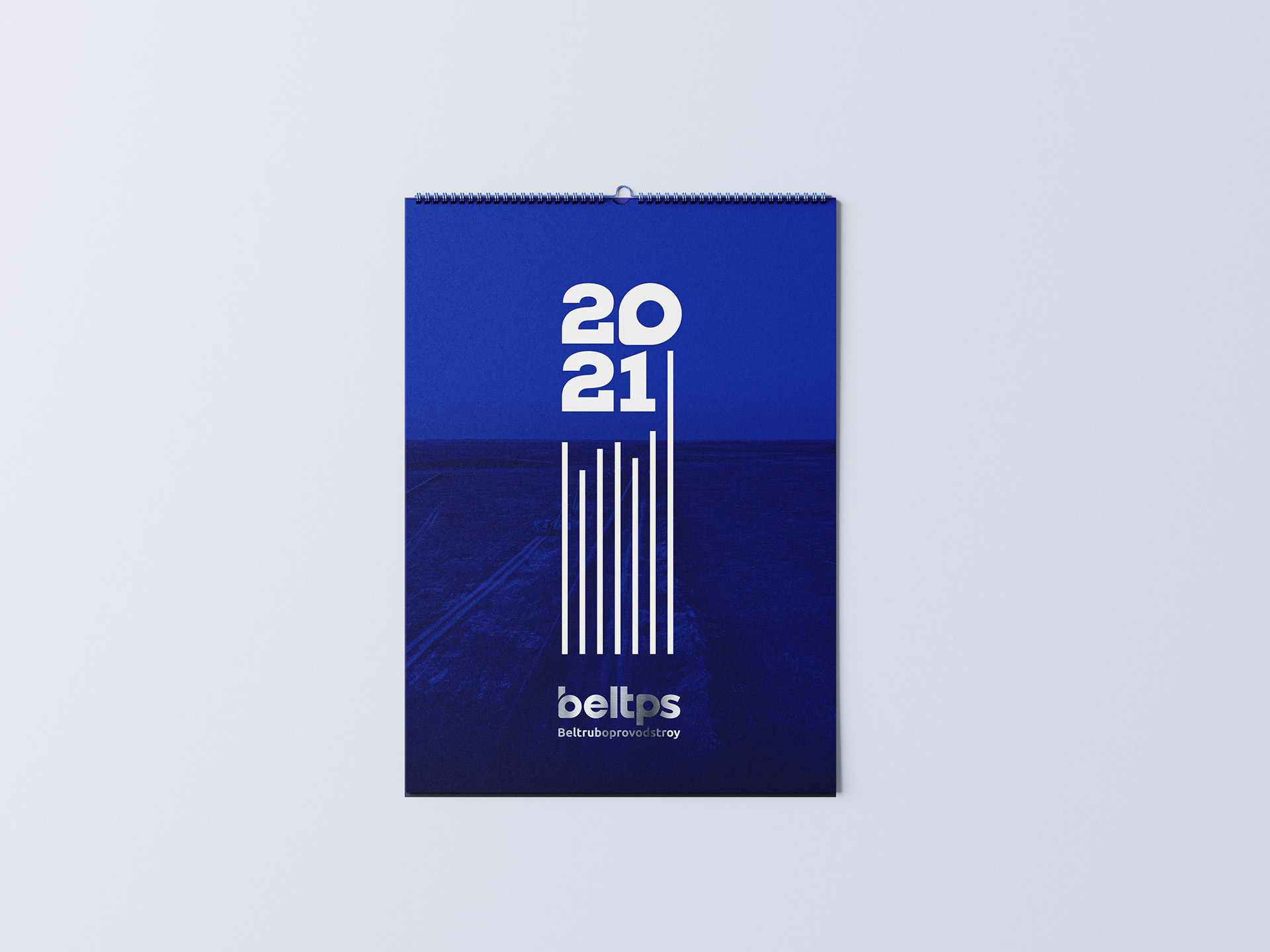
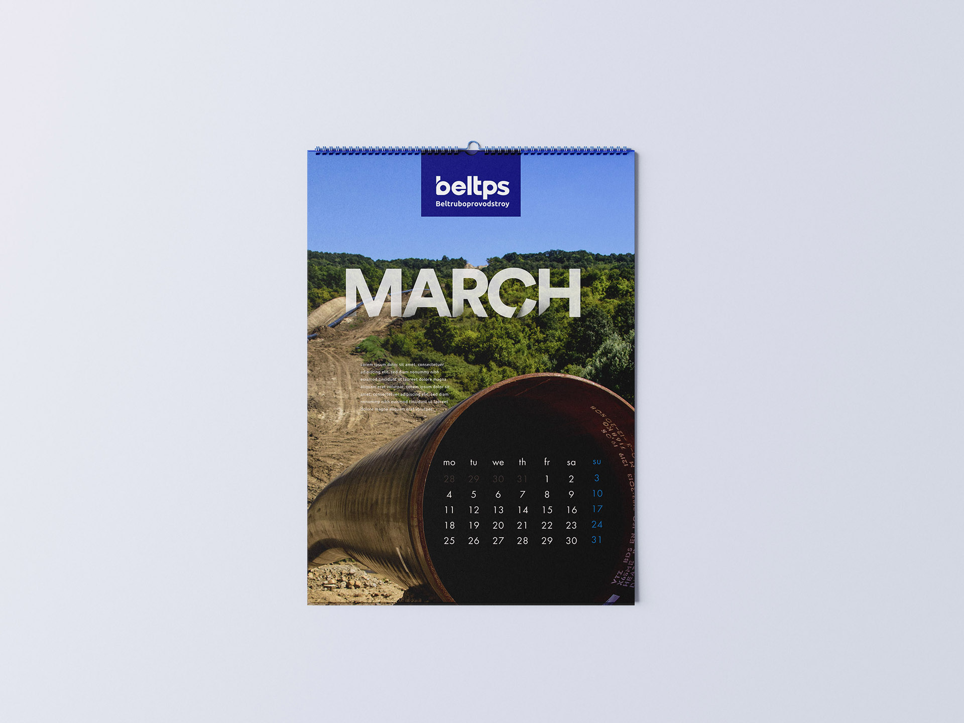
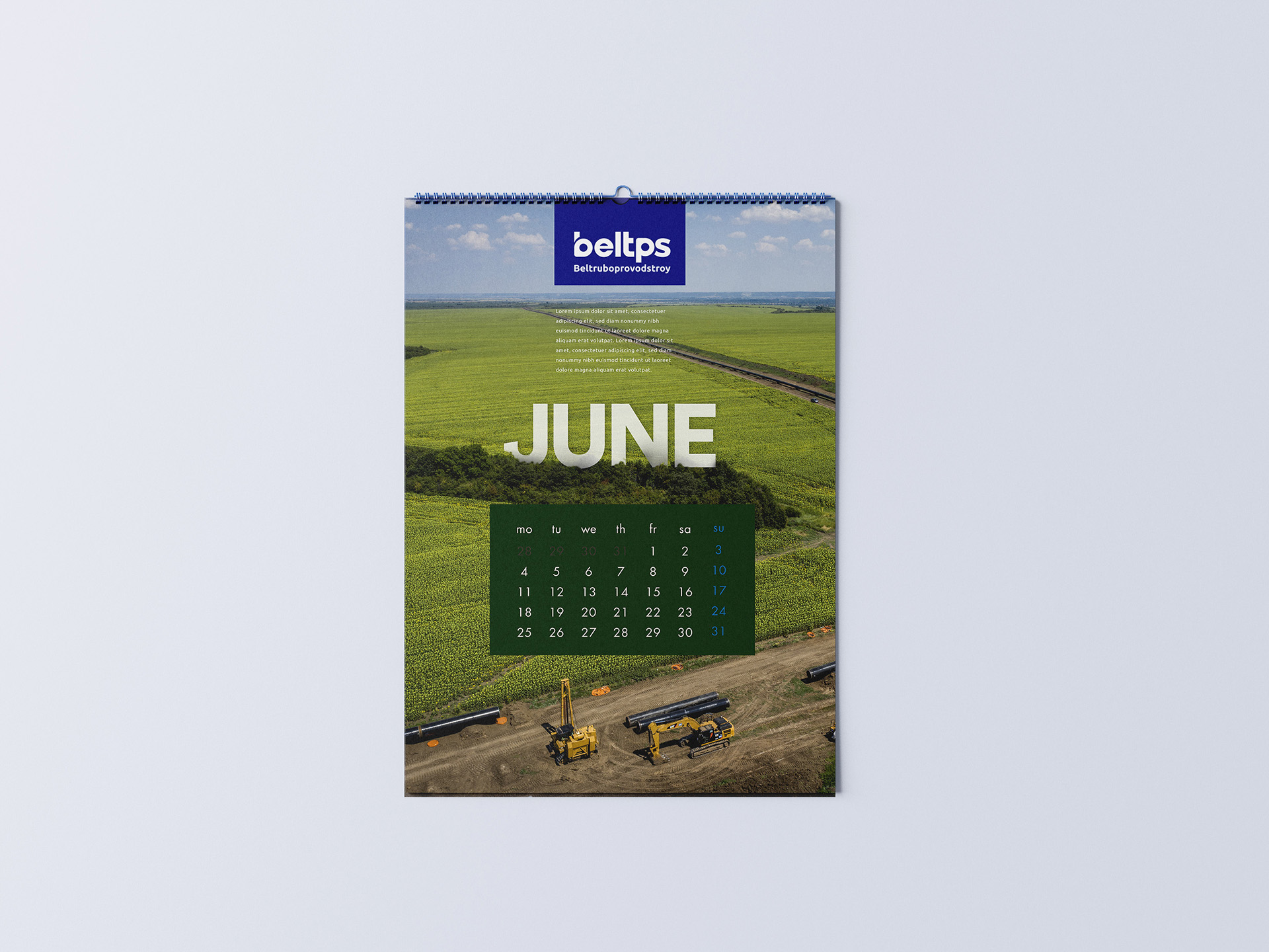
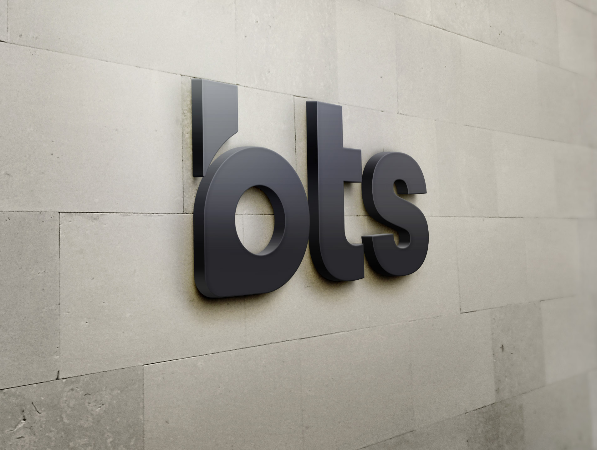
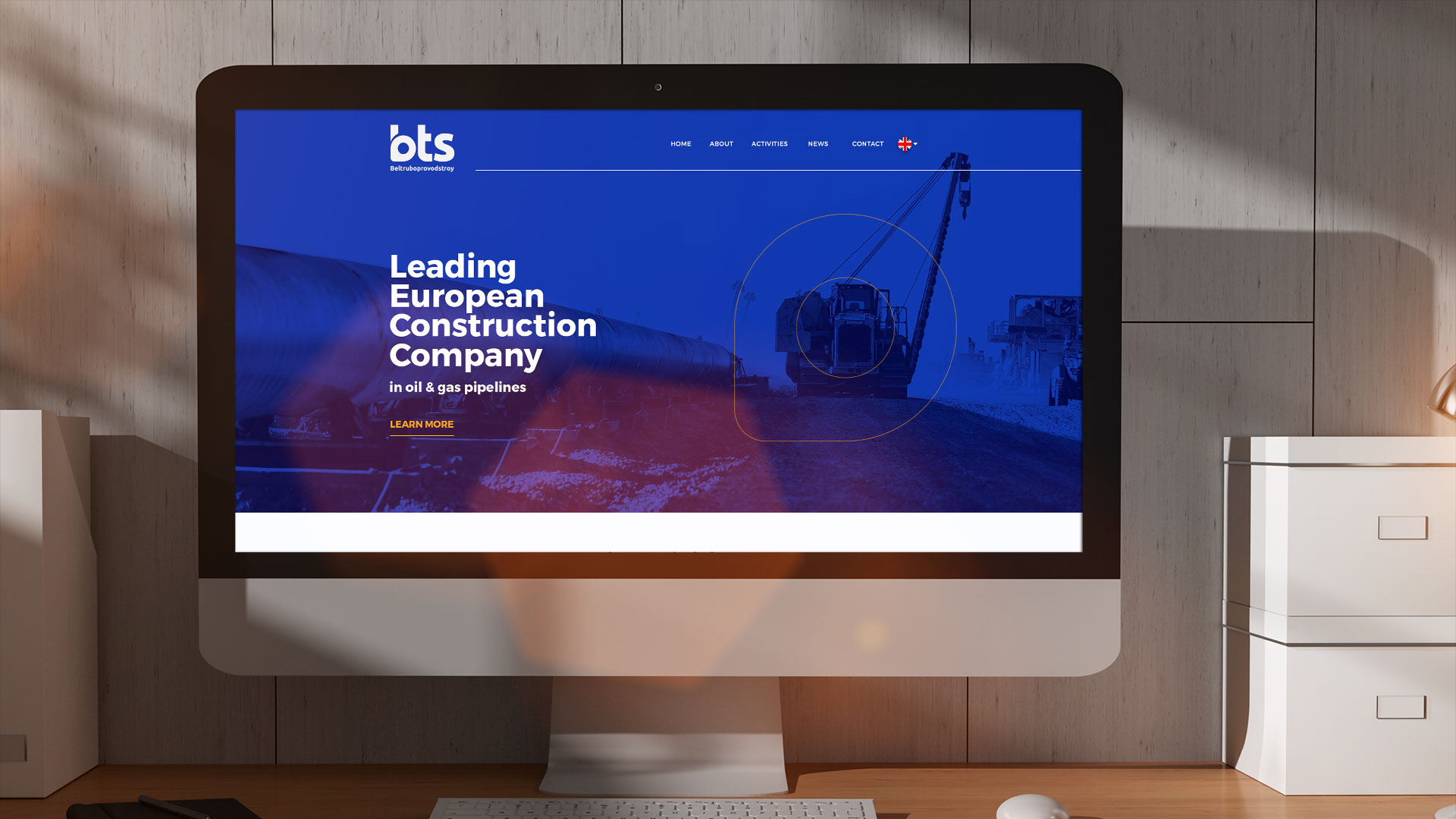
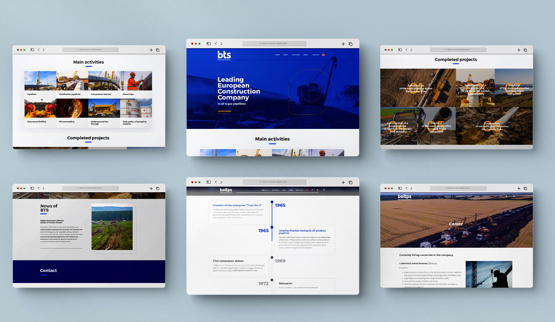
Bts is one of the leading European companies in the field of civil engineering. Due to a clients’ need to adapt to market trends we have redesigned the corporate identity. The letter B symbol represents the stylization of the pipe of the crane, which is the main trait of the company’s business. The new logo represents simpler and more shaped version of the previous solution, and the final result is the logo that makes an impression. Since color plays an important role in creating a complete identity, we chose blue which implies professionalism, thoughtfulness, integrity, honesty and tranquility and it is in complete accordance with company’s business activities. Well and modernly created redesign of the entire corporate identity undoubtedly leads to the company’s recognition and its distinctiveness among competitors.